

Box Model
Introduction
The box model is a fundamental concept in CSS (Cascading Style Sheets) that defines how elements are structured and displayed on a web page. It provides a framework for understanding how elements are sized, positioned, and interact with other elements. In this article, we will delve into the box model, exploring its key components and how they influence the layout and design of web pages.
The Box Model Components
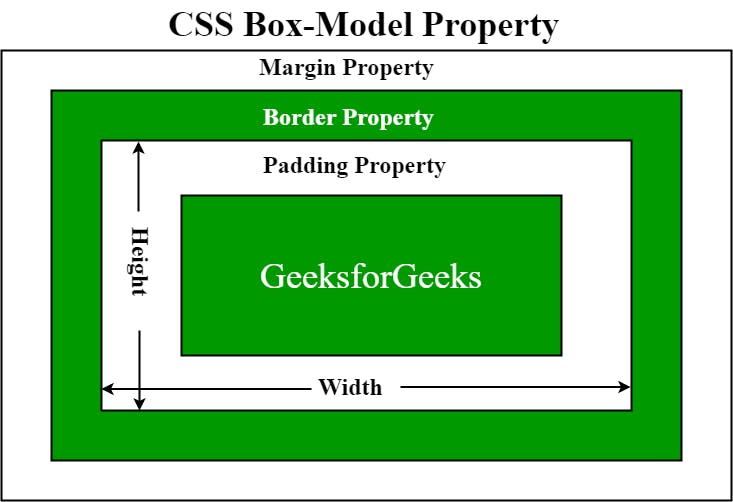
At its core, the box model consists of four main components that define the space occupied by an element: content, padding, border, and margin.
Content: The content refers to the actual text, images, or other media contained within an element. It is the innermost part of the box and determines the size of the visible content.
Padding: The padding surrounds the content and creates space between the content and the element's border. It provides breathing room and affects the overall size of the element.
Border: The border is a line or set of lines that define the edges of an element. It separates the content from the padding and adds visual distinction to the element. Borders can have various styles, widths, and colors.
Margin: The margin is the space surrounding the element, outside of the border. It creates a gap between the element and other elements in the layout, providing spacing and influencing the overall flow of the page.
Understanding Box Sizing
The box sizing property determines how the total size of an element is calculated. By default, the box sizing property is set to "content-box," which means that the specified width and height only apply to the element's content area. The padding, border, and margin are added on top of the specified width and height, resulting in a larger total size.
Alternatively, you can set the box sizing property to "border-box," which includes the padding and border within the specified width and height. This can be helpful when designing layouts, as it allows for more predictable and intuitive sizing calculations.
Controlling Box Model Properties
CSS provides a range of properties to control the different aspects of the box model. Some commonly used properties include:
Width and Height: The width and height properties determine the size of the element's content area. You can specify values using pixels, percentages, or other CSS units.
Padding: The padding property allows you to set the amount of space between the content and the element's border. You can specify different values for each side (top, right, bottom, left) or use shorthand notation.
Border: The border property controls the appearance of the element's border. You can define the style, width, and color of the border using appropriate CSS values.
Margin: The margin property sets the spacing around the element. Like padding, you can define individual margin values for each side or use shorthand notation.
Media Query
Introduction
With the ever-increasing variety of devices and screen sizes, ensuring that websites look and function optimally across different platforms has become crucial. Media queries, a feature of CSS3, provide a powerful tool for creating responsive web designs that adapt to various viewport sizes and device capabilities. In this article, we will explore media queries and their significance in building responsive and user-friendly websites.
Understanding Media Queries
Media queries allow developers to apply different CSS styles based on the characteristics of the device or viewport, such as screen size, resolution, orientation, and even specific features like touch support. By using media queries, web designers can tailor the layout, typography, and overall appearance of a website to provide an optimal viewing experience on different devices.
Syntax and Usage
Media queries consist of a media type and one or more expressions that define the conditions for applying the associated styles. The most common media type is "screen," which targets devices with screens, but other types like "print" and "speech" are also available.
Here's an example of a basic media query:
@media screen and (max-width: 768px) {
  /* Styles applied when the viewport width is 768px or less */
  /* Adjust layout, typography, or any other CSS rules as needed */
}
In the example above, the styles inside the media query block will be applied when the viewport width is 768 pixels or less, making it suitable for smaller devices like mobile phones or tablets.